The science behind designs that work
 Sharbel Safyi, CEO·Jul 9, 2026
Some designs work because they are not decoration, they are behavioral engineering. Good design is a set of levers, hierarchy, contrast, size, color, whitespace, and the call to action, that quietly decide what you notice first, how you feel about it, and what you do next. I have spent years pulling those levers for brands, and the good news is that they are learnable. Here is how each one works.
Design is behavior, not decoration
Design's real job is not to look nice, it is to change behavior. Before a visitor reads a single word, your layout has already told them where to look, what matters, and whether to trust you. People form a first impression of a page in about 50 milliseconds, and most of that snap judgment is visual, not verbal. Design speaks first.
For years my job was marketing for large brands, and the thing that took me longest to accept is that taste is not the point. A design is a machine for producing a feeling and an action, and every choice, where a headline sits, how big the button is, how much empty space surrounds it, is a nudge. It is not a soft claim, either. In a Stanford study of how people judge a site, the way it looked was the single most-mentioned reason people gave for trusting or distrusting it, ahead of the actual content. A beautiful layout that points nowhere still loses to a plain one that points at exactly the thing you want done. So the question is never "is this pretty." It is "what does this make someone feel, and where does it send them next."
Visual hierarchy decides where the eye goes first
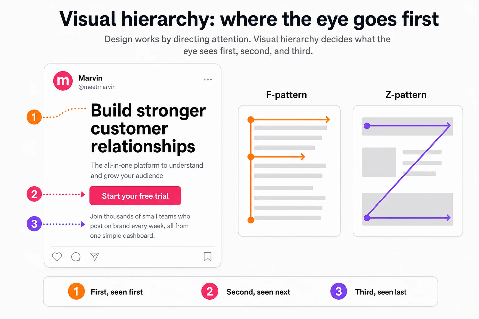
Visual hierarchy is the order your design leads the eye through. You set it with size, color, contrast, and position, so the most important element is seen first and the least important last. Get it right and a stranger gets your point in a glance. Get it wrong and they see everything at once, which means they really see nothing.
Start here, because it is the master lever. People do not read online, they scan: in Nielsen Norman Group's classic testing, 79% of users scanned any new page and only 16% read it word for word, moving through the screen in predictable shapes, an F-pattern down text-heavy pages and a Z-pattern across sparse ones. The reader will not study your work top to bottom, they jump to whatever is loudest, then the next loudest, then leave. Hierarchy is you choosing that order on purpose instead of leaving it to chance. Before you write a word of copy, you should be able to point at your design and say: this is seen first, this second, this third. If you cannot, the reader decides for you, and they usually decide wrong.
Contrast is how you point
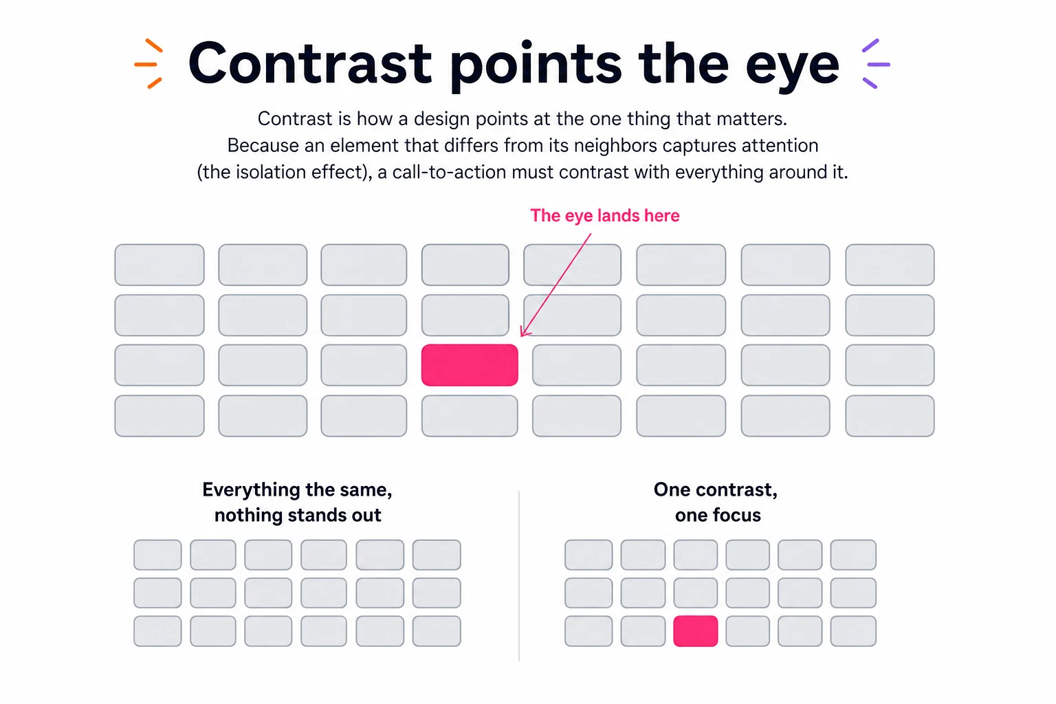
Contrast is how a design points at one thing. The eye is pulled to whatever breaks the pattern, so the element that differs from everything around it gets noticed first. Designers call this the isolation effect, and it is exactly why your call to action should never blend into the page. When everything competes for attention, nothing wins it.
Contrast is not only light against dark. It is big against small, color against gray, motion against still, one bright button in a calm field. The rule I keep coming back to is simple: whatever you most want someone to do, make it the single most contrasting thing on the screen. The most common mistake I see from small businesses is treating every element as equally urgent, three buttons, five colors, everything bold, which flattens the whole thing back into noise. Choose the one action that matters and let it stand alone. One difference is one thing seen.
Size is a signal of importance
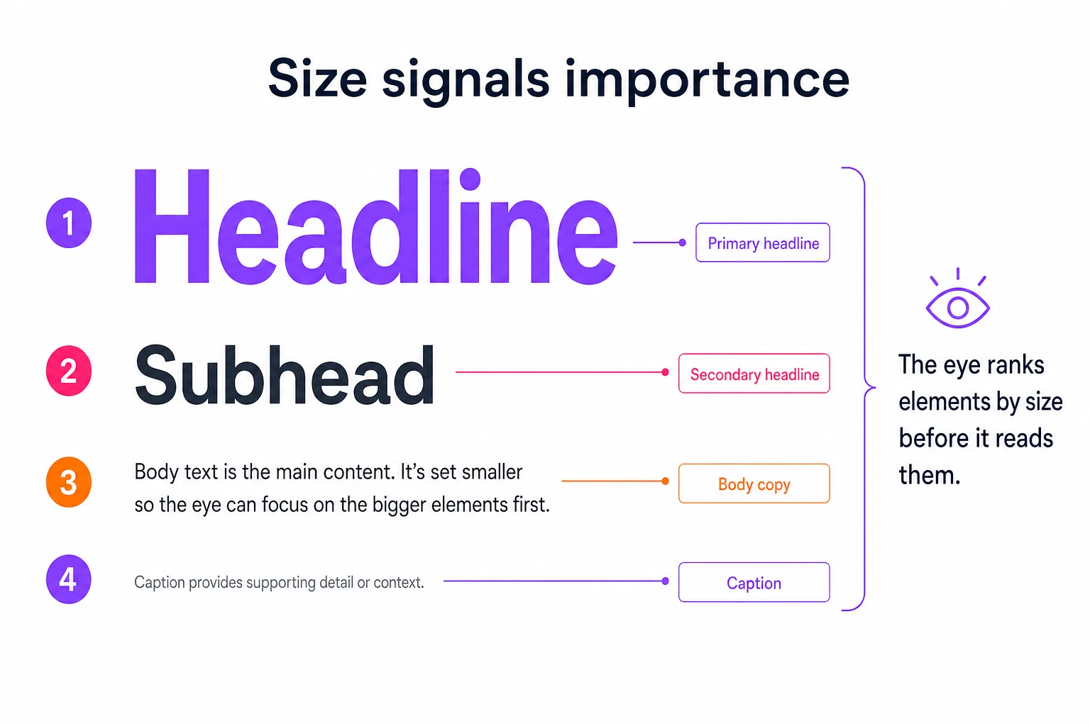
Size is read as importance. Before anyone processes meaning, they rank what is on screen by how big it is, and assume the biggest thing matters most. A clear size scale, a large headline, a smaller subhead, small body text, a tiny caption, hands the reader a map of what to read in what order, without them ever thinking about it.
This is the cheapest way to build hierarchy, and the most abused. When everything is the same size, you have told the reader nothing about what matters, so they have to work it out, and busy people will not bother. When one thing is clearly the biggest, you have made the choice for them. The skill is restraint: a real scale has only a few steps, and the jumps between them are obvious. If your headline is 18 pixels and your body is 16, that is not a hierarchy, it is a rounding error. Make the important thing unmistakably bigger, and let the small things be genuinely small.
Color makes people feel before they read
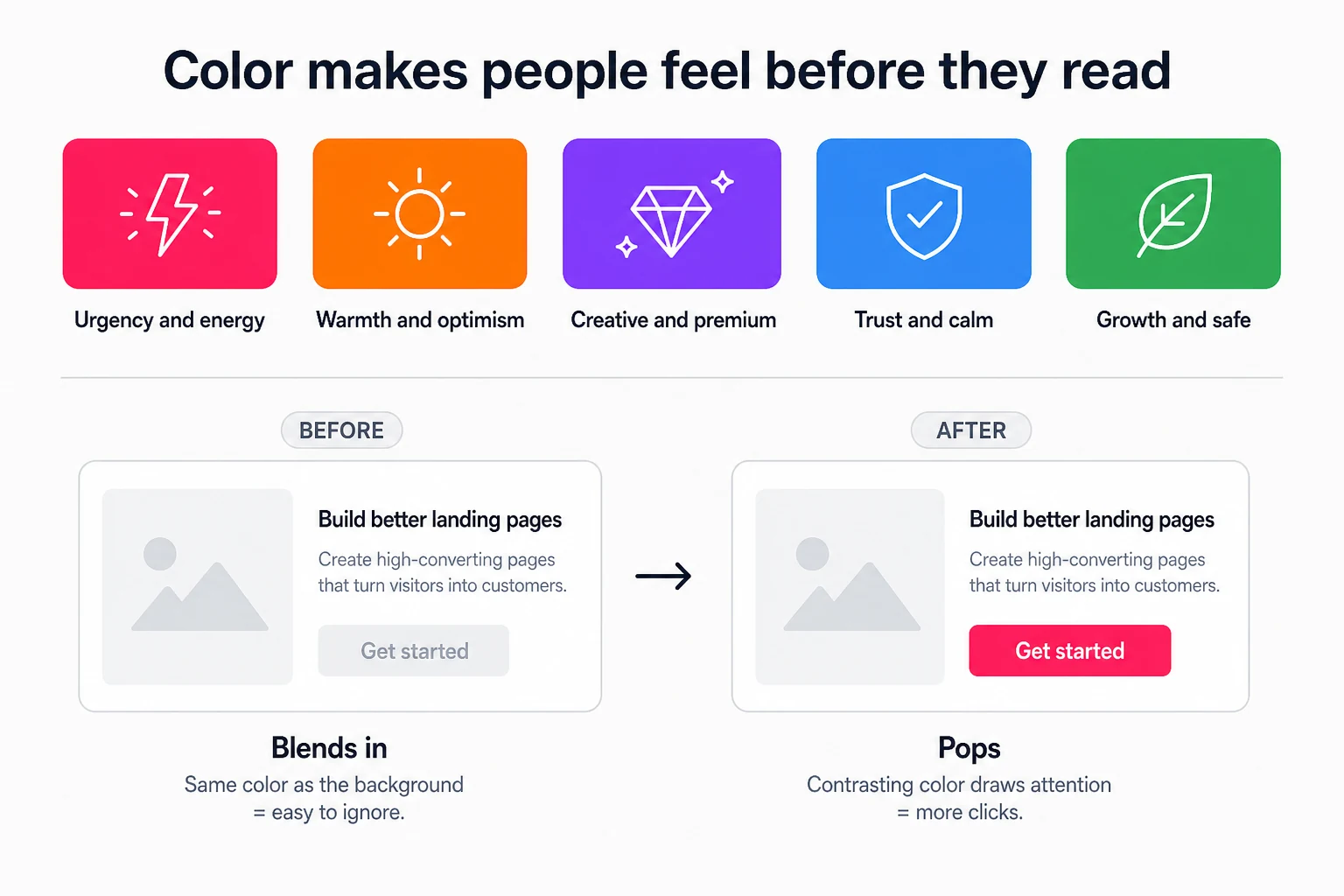
Color is the fastest emotional signal in a design. People react to it before they read a single word, and research on snap product judgments found up to 90% of that first assessment can come from color alone. Warm reds and oranges feel urgent and energetic, blues feel calm and trustworthy, purples feel premium and creative. Your palette sets the mood the words then have to live up to.
There are two jobs here, and people usually do only the first. Job one is mood: your brand colors should match the feeling you want, a bank leans blue for trust, a kids brand leans bright and warm for play. Job two is contrast, and it is where clicks are won or lost. Your call to action needs a color that stands apart from the rest of your palette, because a button that blends into the page is invisible. In one well-known test, changing a button from green to red lifted clicks by 21%. The button did not get smarter, it got more contrast, because green was already the page's main color. Pick a palette for the feeling, then keep one loud, contrasting color that means "act here" and use it nowhere else.
Whitespace tells the eye where to look
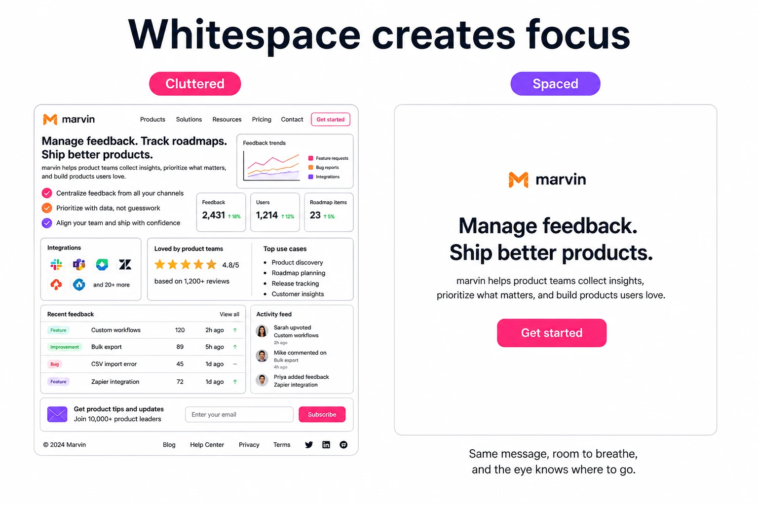
Whitespace is not wasted space, it is focus. The empty room around an element is what makes that element stand out, and giving text margins and room to breathe makes it easier to read and understand. Crowd everything edge to edge and the eye has nowhere to rest, so it rests nowhere. Space is how a design says: this, and only this, right now.
Small businesses tend to fear empty space, it feels like a wasted opportunity, so they fill every pixel with another offer, another line, another badge. It backfires. The more you put on screen, the less any single thing is worth, and the harder you make the reader work. Effortless is a feeling, and space is how you create it. Look at the brands you trust most and notice how much of their layouts is simply empty. That emptiness is not laziness, it is confidence, and it is doing the quiet work of aiming your attention at the one thing they want you to see.
The call to action is the whole point
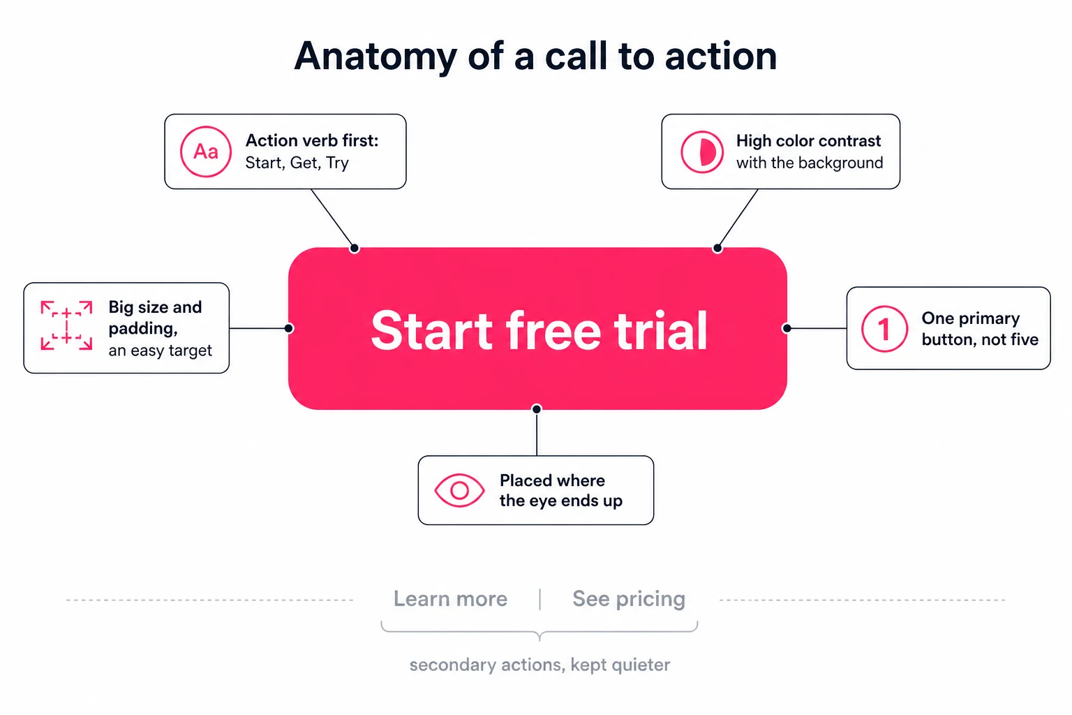
Almost every design is built to produce one action, and the call to action is where the other levers point. A strong CTA leads with an action verb, contrasts hard with everything around it, is big enough to be an easy target, and is the single obvious next step. Give people one clear thing to do, and far more of them take it.
This is where hierarchy, contrast, size, color, and whitespace all cash out. A call to action is not a decoration you add at the end, it is the destination the whole layout was quietly steering toward. The wording matters more than people expect: "Start free trial" beats "Submit," because it says what happens next and it opens with a verb. And the number of them matters most of all. The instinct is to offer every option at once, sign up and read more and follow us and contact sales, but each extra choice splits attention and slows the decision. When Whirlpool cut a campaign email from four calls to action down to one, clicks rose 42%. One primary action, styled to stand out, with everything else made quieter. That is the difference between a design people admire and a design people act on.
One message, three different jobs
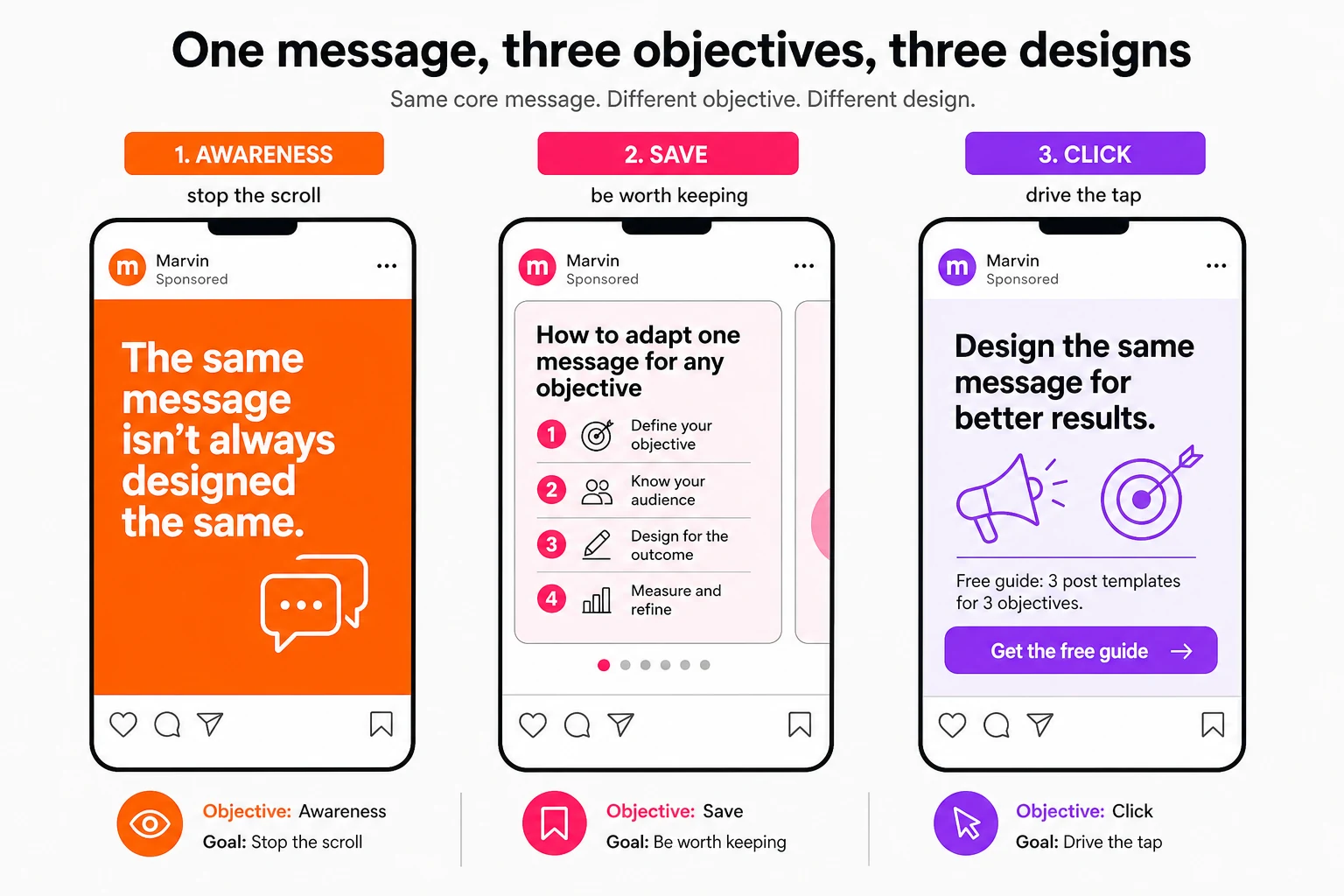
Here is the part most people miss: the same message should be designed differently depending on what you want it to do. A post built for awareness, a post built to be saved, and a post built to be clicked are three different designs, because they have three different jobs. Decide the objective first, and most of the design decisions make themselves.
Take one idea, say a new feature you launched. For awareness, you want to stop the scroll, so the design is a single bold visual and a few big words, no button, because the only job is to be noticed. To be saved, you want to be useful enough that someone keeps it, so it becomes a step-by-step carousel with real value on each slide, built to be returned to. To drive a click, you strip it down to one offer and one loud, contrasting button, because the only thing that matters is the tap. Same message, three jobs, three completely different designs. The moment you design without naming the job first, you get something that looks fine and does nothing.
A format for every objective
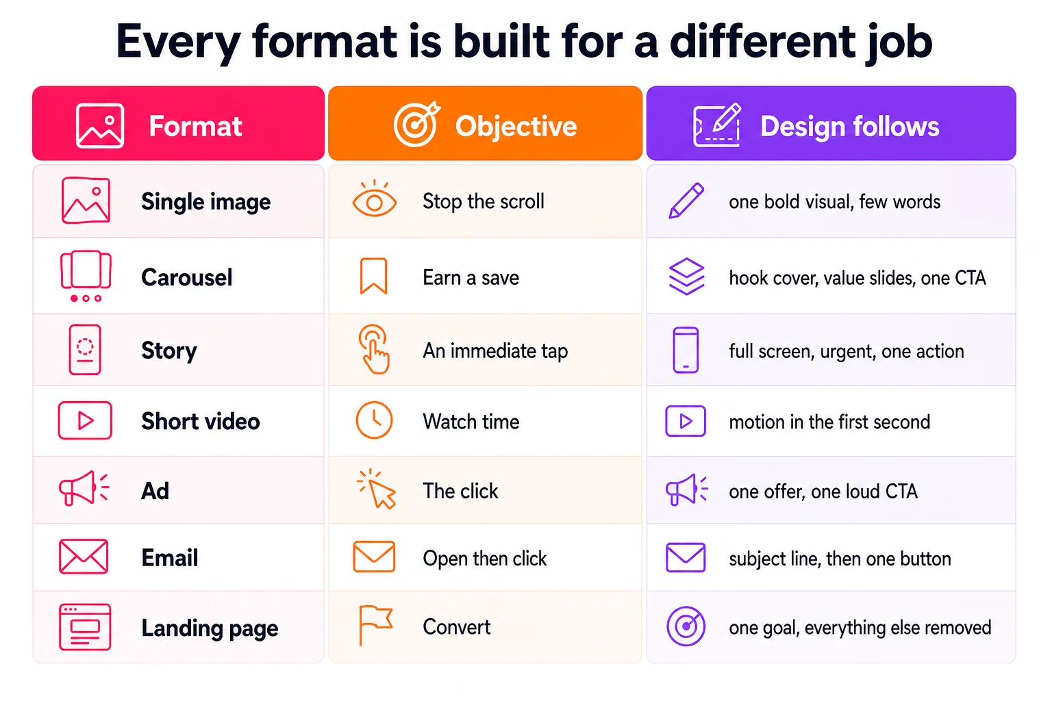
Every content format exists to do a particular job, and its design follows from that job. A single image is built to stop the scroll, a carousel to earn a save, a story to get an immediate tap, an ad to win the click, an email to be opened then clicked, a landing page to convert. Match the format to the objective, then design for what that format is good at.
This is why a carousel looks nothing like an ad, and why neither looks like a landing page. Carousels are the most saved and highest-engagement format on Instagram, earning around 109% more engagement per person reached than Reels, which is exactly why their design is a hook cover, value in the middle, and one CTA at the end, a shape tuned to earn the save. An ad is the opposite, one offer and one button with everything else stripped away, because its only job is the click. A landing page removes the navigation and every competing link so the single goal has nowhere to leak. Once you know what a format is for, you stop asking "does this look good" and start asking "is this built for its job." That is the whole game.
Design on purpose
Put it together and design stops being a matter of taste and becomes a matter of intent. You name the objective, then hierarchy, contrast, size, color, whitespace, and the call to action all line up behind it. None of these levers is exotic, and you will start to see each one working the next time you scroll. What is genuinely hard is pulling all of them, on brand, in the right way for the right format, on every single post, every week. Doing it once is a skill. Doing it every time is a job.
That is the reason we built Marvin. The principles in this post are built into it, so when you give it the objective and the format, it designs for the job, a carousel shaped to be saved, an ad shaped to be clicked, in your colors and your voice, without you needing to know the science behind any of it. It is the same do-it-yourself design work I have written about doing by hand, packaged so you are not the one assembling it, and held to your brand so it never drifts into the flat, generic look everyone else gets. Learn these levers and your own eye gets sharper. And when you would rather name the goal and let the design follow, that is what Marvin is for.
Frequently asked
- Why do some designs work and others do not?
- Because designs that work are built to change behavior, not just to look good. They use hierarchy, contrast, size, color, and whitespace to direct attention toward one clear action, so a viewer knows instantly where to look and what to do. Designs that fail treat every element as equally important, so nothing stands out and no next step is obvious.
- What is visual hierarchy in design?
- Visual hierarchy is the order a design leads the eye through its elements, set with size, color, contrast, and position. It makes the most important thing get seen first and the least important last. Strong hierarchy lets someone understand your main point at a glance, instead of having to study the whole layout to find it.
- What makes a good call to action?
- A good call to action leads with an action verb like Start or Get, contrasts sharply in color with everything around it, is large enough to be an easy target, and is the single obvious next step on the screen. Offering one clear action instead of several competing ones is what most reliably lifts the number of people who take it.
- Why should the same message be designed differently for different platforms?
- Because each format and platform has a different job. A post made for awareness is designed to stop the scroll, one made to be saved is designed to stay useful, and an ad is designed to win a click. Reusing one identical design everywhere ignores those jobs, so it underperforms on each. Decide the objective first, then design for it.